Color is one of the most powerful tools that interior designers use to create captivating and emotionally resonant spaces. When applied thoughtfully, color theory transforms rooms, bringing balance, harmony, and depth to interiors. Luxury interior designers in Bangalore, in particular, rely heavily on color theory to craft spaces that exude elegance, sophistication, and personality. Whether it’s in residential homes or high-end commercial projects, the right color palette can dramatically elevate a space.
In this article, we will explore how color theory is used by interior designers to elevate their projects, particularly in luxury interiors. We will also discuss how top interior design companies leverage these techniques to create visually stunning environments.
Introduction to Color Theory in Interior Design
At its core, color theory refers to the guidelines and principles used to create harmonious color combinations. This knowledge helps designers select the best hues, shades, and tones for specific spaces, setting the tone and mood of a room. Color theory is rooted in the color wheel, which displays the relationships between primary, secondary, and tertiary colors.
Luxury interior designers often use advanced color theory principles to evoke a specific atmosphere, such as a serene and relaxing bedroom or a vibrant and energetic living room. The careful blending of colors can significantly enhance a space’s visual appeal, making it more functional, inviting, and reflective of the client’s personal style.
The Impact of Color on Mood and Space
Color plays a critical role in how people feel within a space. For luxury interior designers, understanding the psychology of color is essential to creating spaces that not only look exquisite but also evoke the desired emotions.
- Warm Colors (Red, Orange, Yellow) – Warm tones tend to evoke energy, warmth, and excitement. These colors are often used in social spaces like living rooms and dining areas.
- Cool Colors (Blue, Green, Purple) – Cooler shades convey calmness, tranquility, and relaxation. These are popular choices for bedrooms, bathrooms, and areas meant for rest.
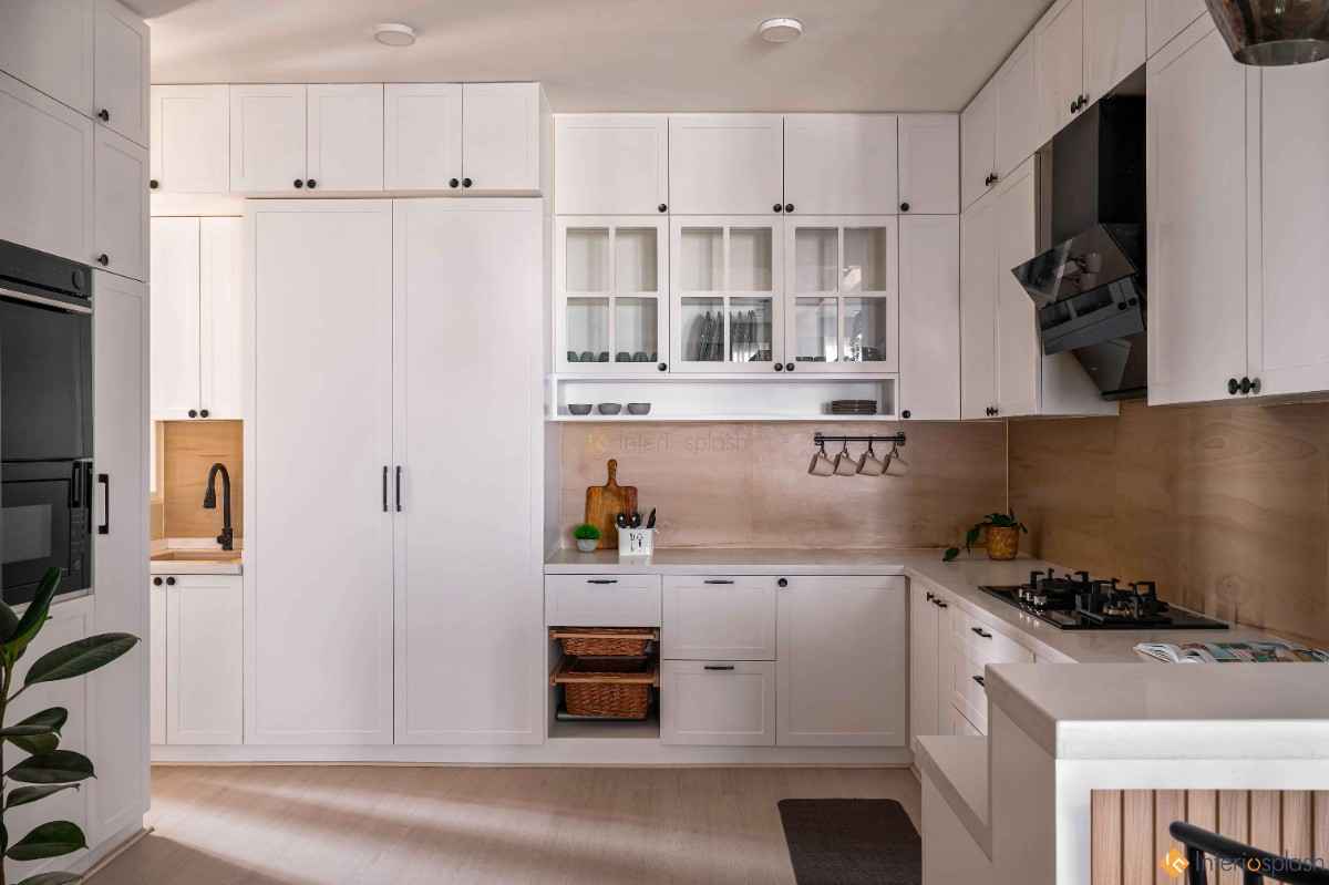
- Neutral Colors (Gray, White, Beige) – Neutrals provide a timeless and sophisticated backdrop in luxury interiors. They allow for more flexibility in accessorizing with bolder colors and textures.
- Accent Colors – Luxury designers strategically use accent colors to draw attention to key features within a space, such as artwork or architectural details.
By combining warm and cool colors, designers create balance in a room, ensuring it feels both inviting and well-proportioned.
Key Principles of Color Theory in Luxury Interiors
Luxury interior designers use several foundational principles of color theory when crafting their projects. These principles help them create cohesive, visually appealing spaces that reflect both functionality and style.
1. Complementary Colors
Complementary colors are located opposite each other on the color wheel. When used together, they create a striking contrast that adds energy and vibrancy to a space. For example, pairing blue and orange or purple and yellow can make a bold statement.
- Examples in luxury design: A deep royal blue sofa against an accent wall of soft, muted gold; rich green chairs paired with burgundy cushions for a classic, sophisticated look.
2. Analogous Colors
Analogous colors sit next to each other on the color wheel and create a sense of harmony and unity. These colors are similar in hue, making them ideal for creating calm and serene environments.
- Examples in luxury design: A serene bedroom with shades of lavender, lilac, and deep purple; a living room with various tones of greens to evoke a connection to nature.
3. Monochromatic Color Scheme
A monochromatic scheme uses variations of a single color, such as different tones, tints, and shades. This approach is elegant and subtle, often used in luxury interiors to create an understated yet sophisticated aesthetic.
- Examples in luxury design: A living room in shades of gray, ranging from soft silver to deep charcoal, accented by metallic finishes for a refined, modern look.
4. Triadic Colors
Triadic color schemes consist of three colors evenly spaced on the color wheel, offering a balanced and visually pleasing combination. This approach can create vibrant, dynamic interiors while maintaining a sense of balance.
- Examples in luxury design: A balanced use of teal, mustard, and coral in a luxury home office to stimulate creativity and focus.
How Interior Designers Use Color Theory to Maximize Space
Luxury interior designers also rely on color theory to manipulate the perception of space. The right color palette can make a small room feel more expansive or a large room feel more intimate.
1. Creating a Sense of Space
Light colors tend to make a room feel larger and more open, which is why many luxury interior designers use soft neutrals and pastels in smaller spaces. By reflecting light, these hues create a sense of airiness and openness.
- Examples in luxury design: A small apartment living room painted in soft cream or pale gray with minimalist decor to create an airy, spacious feel.
2. Adding Depth and Intimacy
Darker colors, on the other hand, can make a space feel cozy and intimate. When applied correctly, deep shades like navy, emerald, or burgundy add drama and depth to luxury interiors.
- Examples in luxury design: A formal dining room with dark teal walls and gold accents to create a rich, luxurious ambiance.
3. Balancing Proportions
Luxury designers use color to visually balance the proportions of a room. For instance, painting the ceiling a lighter color than the walls can make it feel taller, while using darker colors at the base of a room can ground the space, making it feel more stable and balanced.
How Interior Design Companies Utilize Color to Enhance Brand Identity
Top interior design companies often use color to create distinct brand identities for their clients, especially in commercial and hospitality spaces. By aligning color choices with a brand’s core values, luxury designers craft environments that resonate with the client’s customers and employees alike.
- Hotels and Resorts: Luxury resorts may use cool blues and greens to evoke a sense of relaxation and escapism for their guests.
- Restaurants: Upscale restaurants often opt for rich reds, deep purples, or gold to create a warm, inviting atmosphere conducive to fine dining.
- Offices: Luxury design firms working with corporate clients may integrate brand colors into the workspace, promoting a cohesive visual identity throughout the office.
Conclusion
Luxury interior designers use color theory not just as a tool, but as an art form to elevate the spaces they create. By mastering the principles of color theory—such as complementary, analogous, and monochromatic schemes—they ensure each room feels perfectly balanced, harmonious, and visually captivating. Moreover, leading interior design companies in Bangalore understand how color can enhance space, influence mood, and even align with brand identity, ensuring that every design they create is a reflection of sophistication and luxury.
Whether you’re designing a cozy residential space or an opulent commercial interior, the right color palette will always be the cornerstone of luxury design.
Leave a Reply